Breeze Self Storage
Delivering a cohesive brand ecosystem for Breeze
- B2C
- Branding
- Creative
- Web Development
Breeze Storage approached Fireworx ahead of its August 2025 launch to create a complete brand identity and digital presence for its first autonomous self storage facility in Barnstaple, North Devon. As a new entrant to the UK market, the business required a logo, a full signage system, stationery templates, a mobile-first website design and a concise brand style guide to support both launch and future expansion.
The Barnstaple site would operate without on-site staff, enabling customers to book online, verify their identity digitally, sign contracts electronically and receive access codes remotely. The brand and website therefore needed to communicate clarity, reassurance and simplicity from the outset.
Challenge
The self storage sector is often characterised by bold, industrial branding. Breeze wanted to take a different approach. The name suggests ease, space to breathe and a relaxed, lifestyle-led experience. Fireworx was tasked with creating a sophisticated but simple identity that would feel approachable and modern, while remaining highly visible on large-scale building signage and equally effective in digital formats.
With between 60% and 70% of projected traffic expected to come via mobile devices, the website design also had to adopt a mobile-first methodology, prioritising speed, clarity and conversion.
Actions
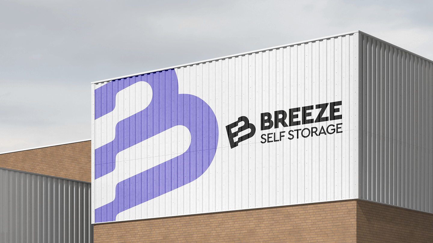
Fireworx developed a series of refined logo concepts centred on openness and space. The final identity features a clean, contemporary wordmark, subtly reinforcing the concept of “breathing room” with a wavy ‘B’ logomark. A carefully considered, bright colour palette ensures strong visibility on exterior signage while maintaining a calm and professional appearance online and in print.
The result is a mark that performs confidently at scale on a building façade, yet remains crisp and legible within a mobile interface.

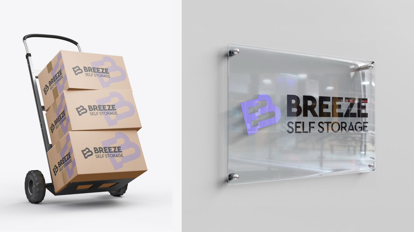
Given the unmanned nature of the facility, signage plays a crucial role in guiding and reassuring customers. Fireworx assisted with a comprehensive signage pack that includes large-format external branding for the building, a freestanding roadside totem sign and a suite of internal directional and informational templates.
Particular attention was given to the reception area, where customers arrive without staff assistance. Large-scale mural concepts and welcoming visual treatments were key to soften the environment and create an immediate sense of trust, calm and professionalism.
Although digitally driven, Breeze required professional stationery for formal communications and documentation. Fireworx delivered a clean letterhead and business card design aligned with the brand’s typographic and spatial principles.
To ensure consistency as additional sites are launched across the UK, a simple brand style guide was produced. This outlines logo usage, colour specifications, typography hierarchy and guidance for both print and digital applications, creating a clear framework for future growth.
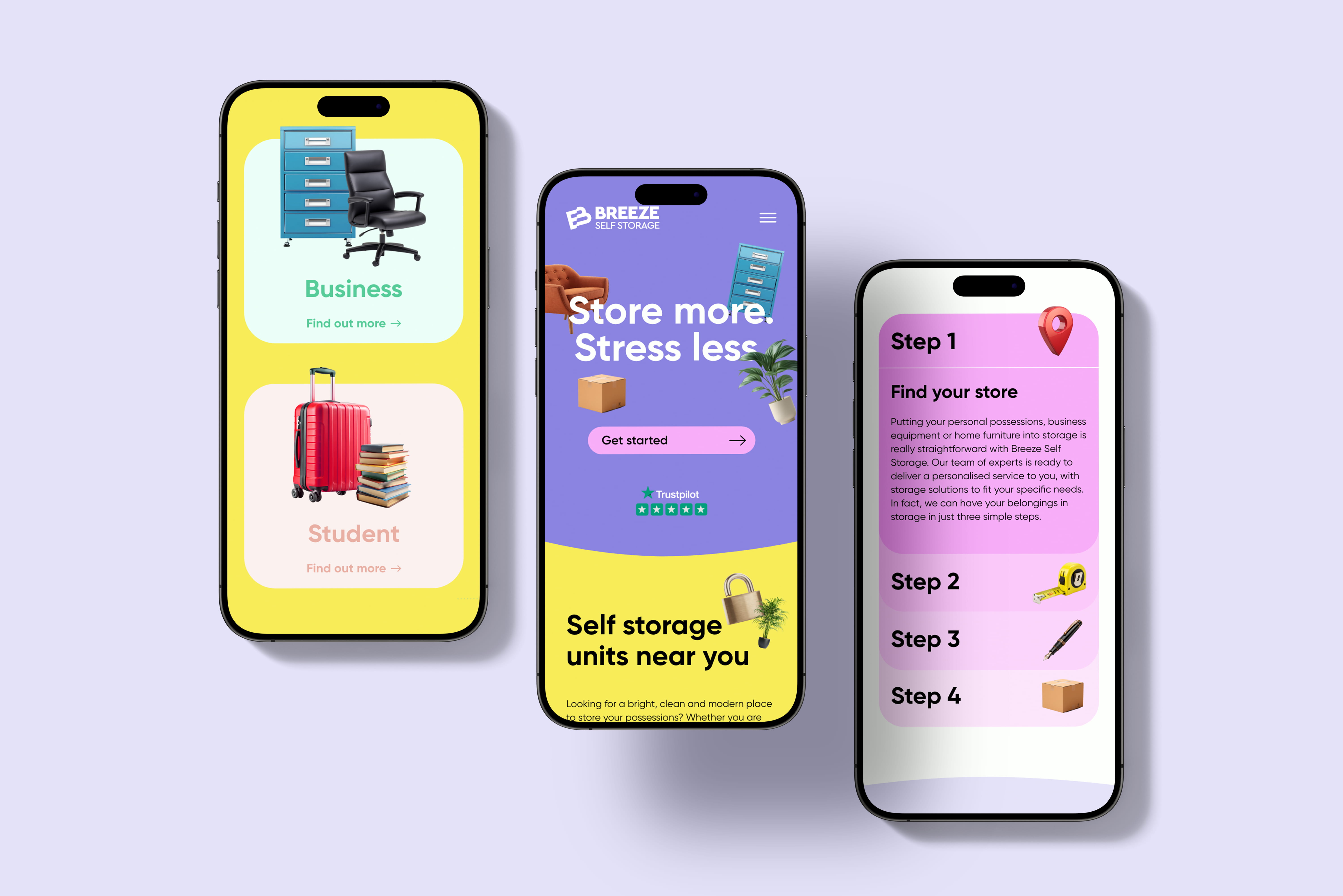
For their brand new website, design began with the mobile experience, focusing on fast load times, intuitive navigation and prominent calls to action. Layouts were then scaled up for tablet and desktop, ensuring a seamless experience across all devices without unnecessary complexity.
Fireworx designed a structured set of core pages, including dedicated sections for personal, business and student storage, alongside practical guidance such as “How It Works,” and FAQs to assist SEO. The design balances informative content with visual reassurance, helping visitors understand unit sizes, pricing structures and the fully digital move-in process.
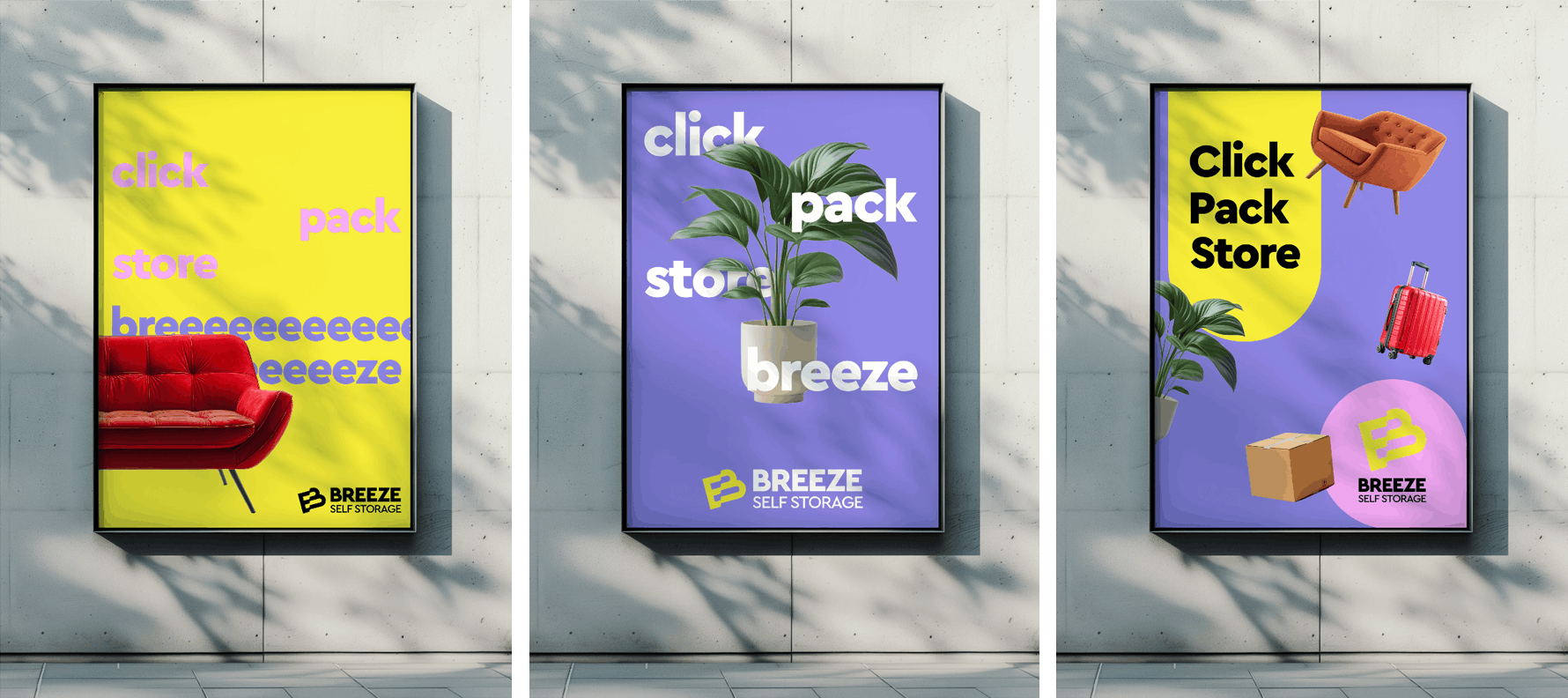
The primary objective was to drive enquiries and online bookings. Clear calls to action, simple explanatory layouts and strong visual hierarchy were used to reduce friction and support confident decision-making. The website design features floating storable objects such as chairs, suitcases, and cabinets giving a sense of ease and adding a ‘breezy’, friendly energy through the pages. This feeling is also conveyed through curved edges and a bold, open font.
Performance considerations were embedded from the outset to enable rapid page loading and smooth integration by Breeze’s digital partner during development.
Outcome
Fireworx delivered a cohesive brand ecosystem in time for launch, equipping Breeze Storage with a distinctive identity, professional collateral, and a conversion-focused website design.
The result is a modern, scalable storage brand that feels calm, accessible and digitally progressive, providing a strong foundation for expansion beyond its first North Devon location.